
Take note – luxury is back
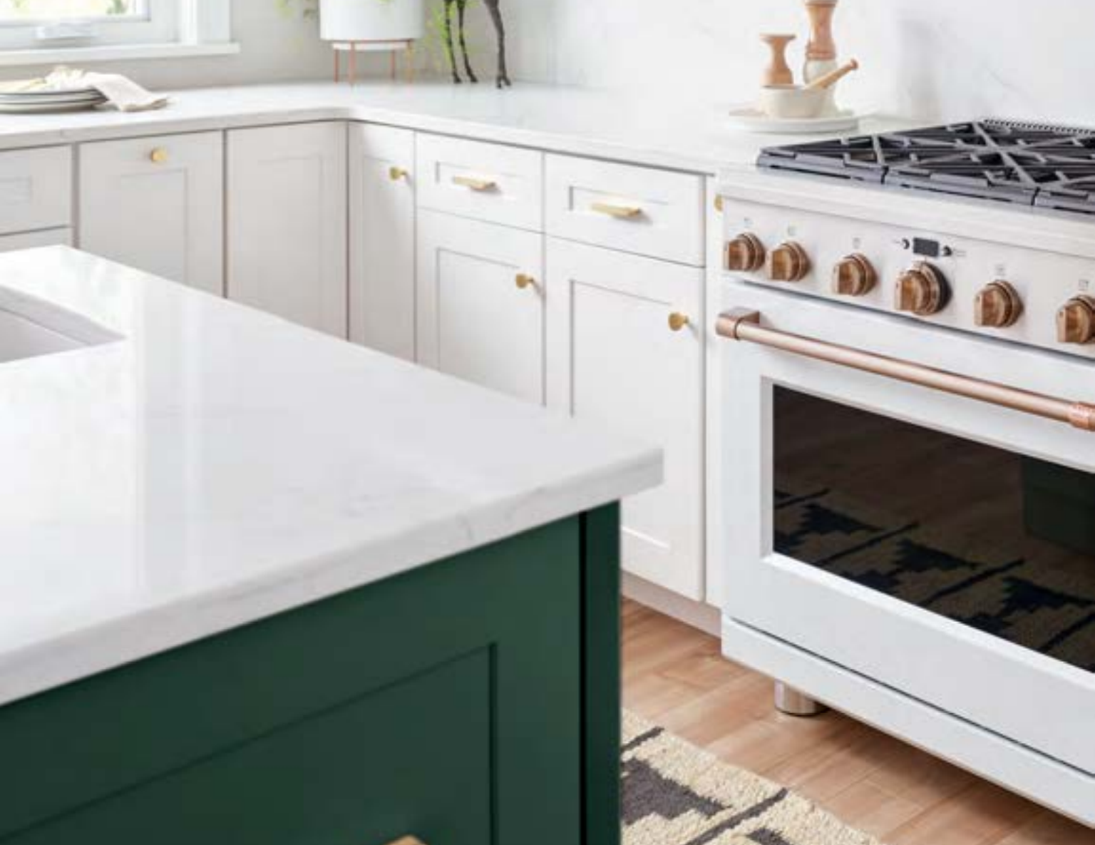
In big ways and small, timeless metals, saturated gem tones and lavish fixtures have marched their way forward in home design, moving the farmhouse trend into our collective rearview mirrors. Consumers are pursuing more conscious luxury and are looking for colors, metals and textures that are timeless. To that end, we are seeing lots of brass, bronze, copper and blackened metals in hardware selections. These finishes play well and add a sense of elegance when paired in traditional, modern or vintage design. Appliance manufacturers have been taking note as well, introducing handle, knob and finish detail options that we haven’t seen for many years. Think of it as jewelry for your kitchen.
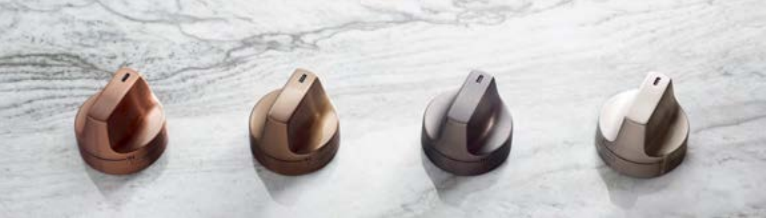
In August, GE Appliances launched the new Café brand with the Matte Collection. It was the brand’s initial leap into customizable products. The company hailed it as “disrupting the industry’s sea of stainless” with finishes of brushed bronze, copper and luxury matte black. Custom handles and hardware are stunning additions. In the Café line, range knobs in copper stand out. The pieces look hand-honed with sleek metal cuff design accents. Refrigerator handles are outfitted against appliance body colors of matte white and black to stunning effect. Consumers can switch out handles and knobs if tastes change, adding flexibility to the initial purchase. When choosing custom statement hardware, homeowners need to consider the interplay with other elements in the space. Paint color also is an important unifying factor. For example, cabinets and walls in jewel tones of emerald, sapphire and onyx create a grounded space for the reflective light of the metals. Think about the cohesiveness of the space and where the eye is drawn. White walls with black cabinets have a classic look that will allow for counter surfaces with lots of movement. Pulling a warm element from the quartz or granite allows for the perfect pop of warm metals to repeat in the faucet, cabinet knobs, appliance handles and even in more unlikely places such as counter stools, small countertop electronics and light fixtures.
When PPG Paints released their 2019 color palette, it named Night Watch (PPG 1145-7) as the color of the year. The deep emerald green is an alternative to black and speaks to the forward-thinking biophilic design and consumers longing to be one with nature. Additionally, the company named Aspen Tan as the stain color of the year. The clean neutral of the shade allows for light to emanate from flooring, echoing a freshness that has been absent with all of the recent dark flooring choices. Color also is showing up in more unusual places, such as copper backsplashes and open shelving with metal brackets. These touches elevate the overall design and give an added depth of visual texture. Kitchens are the heart of the home and the importance on aesthetics in these spaces cannot be denied. Take some time to meet with the experts, fashion a good budget and don’t be afraid to take the plunge into your kitchen remodel in 2019—you will be glad you did. To learn more about this year’s palette and for inspiration visit www.voiceofcolor.com. You can play “The Color Game,” a quick photo quiz that will have you living in color in no time.